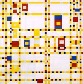
(via)
Happy Halloween!
Ah, it’s been too long since my last Made-Up History post, so a refresher for anyone who is new here: Made-Up History is a series on this blog, in which I recreate art on my face. They’re not meant to be literal translations, just an interpretation that’s almost always wearable.
Today’s subject is by Piet Mondrian, a Dutch painter who was a major contributor of the De Stijl art movement, which was somewhat a proponent of pure abstraction in the Netherlands.
“It [De Stijl] was posited on the fundamental principle of the geometry of the straight line, the square, and the rectangle, combined with a strong asymmetricality; the predominant use of pure primary colors with black and white; and the relationship between positive and negative elements in an arrangement of non-objective forms and lines.” (via Guggenheim, plus more on De Stijl here)

Mondrian: Composition II in Red, Blue and Yellow

Mondrian: Broadway Boogie Woogie
However, today, I am focusing on one called Composition with Yellow, Blue and Red, which he created between 1937 and 1942. It is currently owned by Tate, London but is on loan to Kunstmuseum Basel, Museum für Gegenwartskunst (Basel, Switzerland). Like most of Mondrian’s work, the elements of this piece are reduced to five colors and tones—yellow, blue, red, white, and black—as well as sharp, clean lines and shapes.
His process of eliminating elements was a gradual progression. For example, he did away with curved lines in 1916, and then removed discernible subjects by 1916. According to Tate, “He felt this art reflected a greater, universal truth beyond everyday appearance.” Since his work is very distilled, I chose to be very careful with how I interpreted his work. It seems hard, but it was quite interesting to figure out how to use all of the colors without going overboard.
Anyway, ’tis all very simple! This black cut-crease was harder to do than it probably looks~ I have hooded eyes, but I wanted that peak of yellow, and that strong black line. I ended up blending them together, despite wanting a really sharp and strong crease.
I lined my lower waterline and tightlined my upper waterline with Perversion, and smudged a blue eyeshadow on my lower lash line. I curled my lashes and added Maybelline’s The Rocket Mascara, which is proving to be one of my favorites. Le sigh.
Cheeks are Tarte’s Exposed. Lips are Le Métier de Beauté’s Signature Red. I concealed a little under my eyes, but if I had to do this all over again, I’d have gone for a way stronger brow and a cleaner, foundationed face.
Anyway, I hope you enjoyed! Can you believe that I am wearing all the primary colors here?! Insanity. I never thought I would/could, but it actually looks nice! For more Made-Up History, click here.


Great interpretation! I loove the eye makeup! 😍
Thanks Tina! 😀
good job! I think you did awesome on the look 😀 it totally is mondrian i think!
Thank you, Joyce! Much appreciated. 😀
Amazing!
Thank you! x
Eep! The eye make-up is soooo lovely!
Thank you, Lizzy! I’m glad you think so 😀
This one is the best in the series! I love your eye makeup!
Thank you, Pat! 🙂
Gorgeous! T_T
Thank you T^T
Love this look! And you know how I feel about this series of yours, it brings me joy every time I see you’ve done one 🙂
HEE, so glad! They’re really awesome to do. I get a refresher course (to fact check my info), so that’s always nice. 😀
Very nice! Good job on creating this look.
Thank you 🙂
Omg. That inspiration. You’re such a broad minded girl :3 love the yellow n blue combo.
Aw, thank you. 🙂 I really appreciate that!
So pretty! Favorite!!! ❤
Hee, thank you!! 🙂
The cut crease looks amazing on you and the colors are gorgeous!!! I’d honestly wear this a bunch of places, especially if the yellow was substituted for green, purple, gold…endless possibilities 🙂
Thank you so much! 🙂 That’s true; those would be beautiful alternatives. I didn’t think I’d EVER use black for a cut crease, though!