
Yay a new Made-Up History! When I made this series, I set out to do it once a week. Kinda funny (not really) how it all played out, but I am going to try to play a little bit more with this series since I’ve been kind of meh about makeup combinations lately.
One of the reasons why I haven’t been doing this is because I haven’t found a really nice work that I felt compelled to use for Made-Up History. If you’re new, MUH is a series in which I kind of re-create an artist’s piece as a makeup look by distilling the elements. It’s not really cosmetic art (like how some people re-do Van Gogh’s work on their face), but just translating a work into a look that I may or may not wear everyday. I have done a few of those, which you can see here.
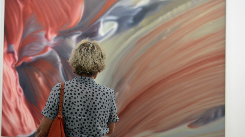
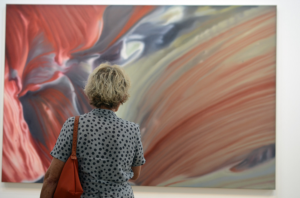
Today, we’ll take on a work by Gerhard Richter, who is one of the most famous living artists (82 years old!) today. Richter, who hails from Germany, has a lot of iconic pieces, but we’ll be taking one of his lesser known (or I suppose not-that-well-documented) pieces, “Détail (rouge-bleu),” which is a blown up image of what looks to be like flowers or cloth.
Here’s what it looks like in full:

source
It may not look like much, but I think the scale and size of it adds greatly to the strength of the piece. Here is how I experienced “Détail (rouge-bleu)”:
There’s not much on this piece by Gerhard Richter, but I did see it at the Pompidou when Richter had a huge exhibit back in 2012. Here are some of my other photographs of the show: Gerhard Richter’s Panorama. He is amazing! Here are a few of them, to entice you to check this post (and the rest of his work) out:
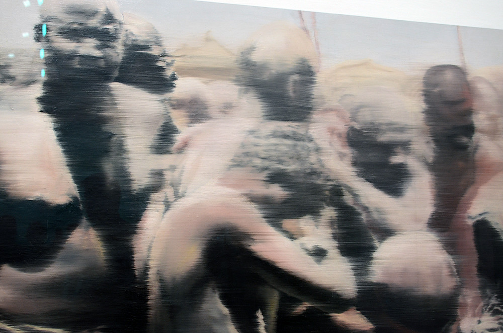
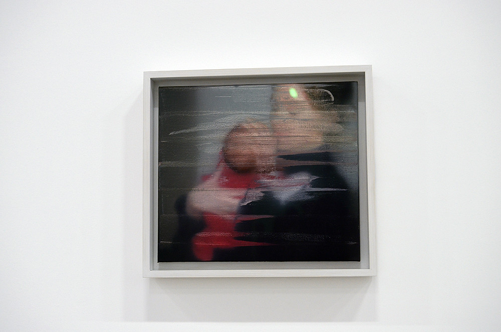
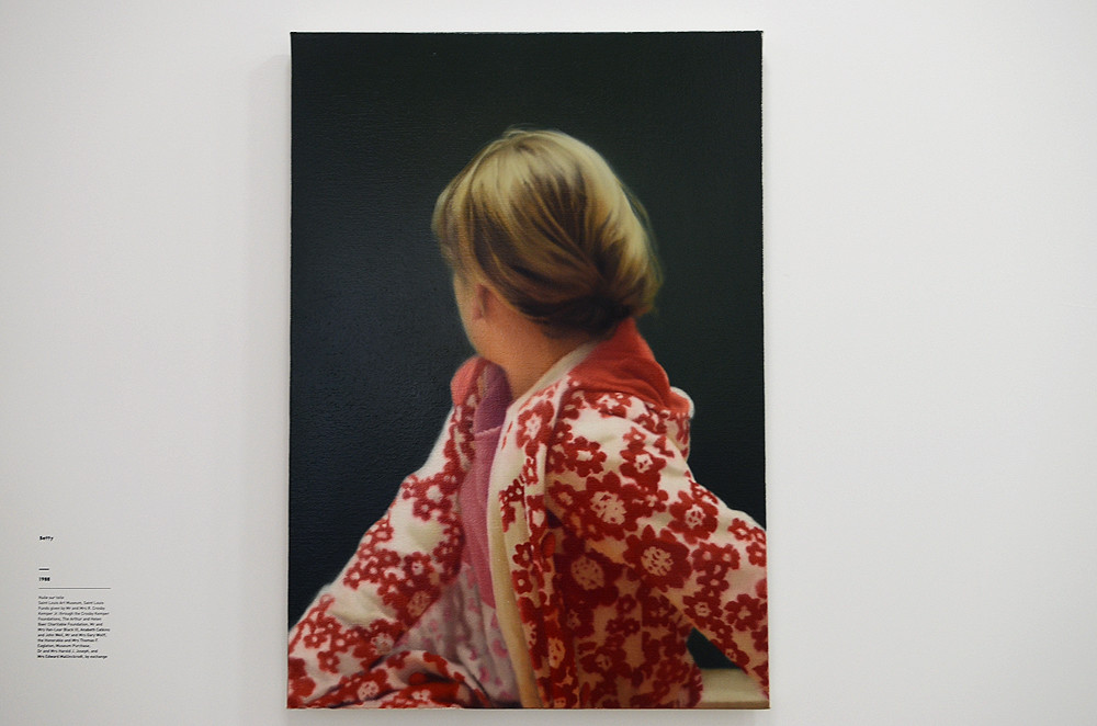
It’s hard to briefly talk about Richter’s work and style, mainly because he explored and experimented so much. One of his most iconic trademarks is the blur, where his paintings (usually based on photographs) are soft-focused or marred by a layer of squeegeed-on paint.
My starting point for reinterpreting “Détail (rouge-bleu)” is to zone in on the corals and cool blue-greys.
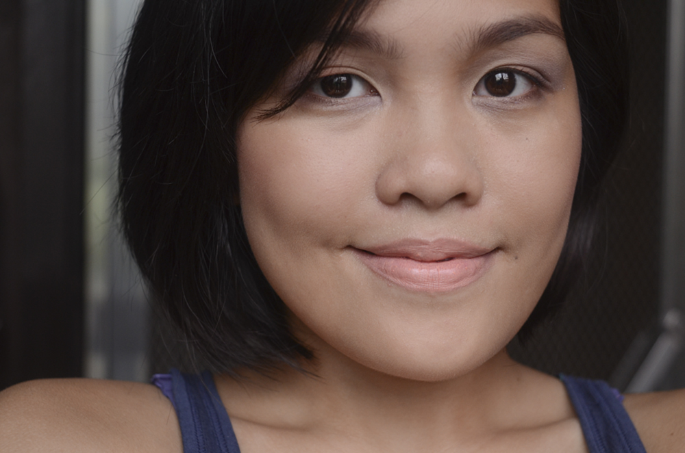
I decided to use coral on my eyes and my lips. I decided to concentrate the blue-grey on the outer corner of my eyes, blowing it up a little bit more than I would usually, since it’s so light and subtle. On the inner corner of the eyes, I’ve applied a pale shimmery yellow. On the outer 2/3 of my lower lash line, I smudged on a cool dark greige mixed in with a burgundy shadow that gradated into the pale lavender/blue-grey in the inner corner. This is the worst part of this look, IMO, because I kind of mindlessly recreated bruise-y under-eyes. I lightly defined my upper lash line with a black-brown liner and a soft mascara.
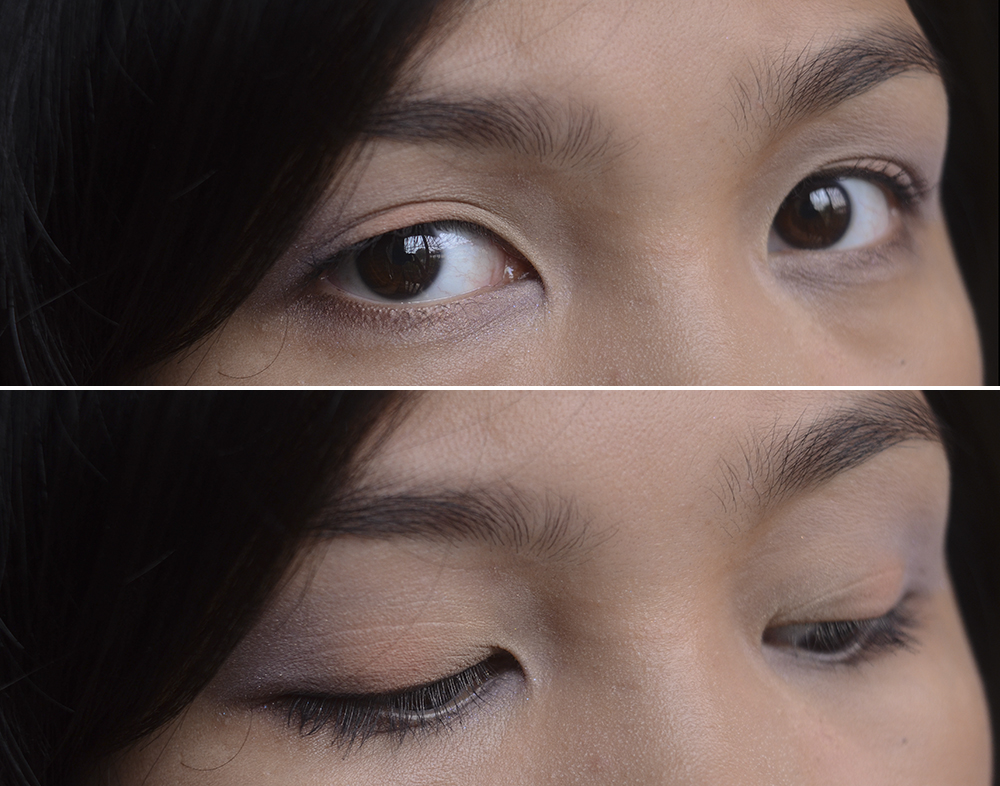

Products Used: Make Up Store Eyeshadow (Touch), Inglot Eyeshadows (312, 344 & darkest shade of 117R, not pictured), Rouge Bunny Rouge Long-Lasting Eyeshadow (Bejewelled Skylark), THREE Eyeshadow Duo (Let the Happiness In, Lavender side only), Urban Decay 24/7 Glide-On Eye Pencil (Crave), 3CE x Pink I’m Good! Mascara*, Hourglass Ambient Lighting Blush (Diffused Heat), OCC Lip Tar (Annika)
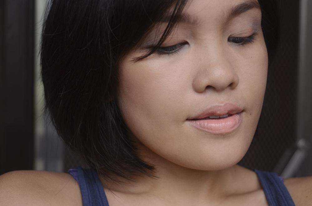
On my cheeks, I used a warm pinky red blush. On my lips, I used a coral, like I said. I mostly like it. I DO NOT like my base, though… I don’t know what happened there, but I think I need to do a cleansweep of my stash (again) soon. Anyway, about the look… What do you think?
For more Made-Up History, click here.
* PR Sample
Follow me: Bloglovin' • Twitter • Instagram • YouTube • Facebook

I really love this series! 🙂 Loving the looks you create! Galing!
Thanks, Juvy 🙂
My favorite series, Carina! Love this look, which looks so undefined, but still distinctly colored. Love it!!
Yay I’m so happy you read these. 😀 Thank you, Belly!
Uy finally! I so missed this series huhuhu.
I can’t decide if I’m missing a darker blue-gray or am content with the overall color balance of this look. Definitely love the corals (especially on the lips) but I feel like the grey could’ve been deeper. Pero kasi with the softness of the lip and the cheeks, I feel like this intensity blue is perfectly suited to the look.
Hallo! Yay, another installation of MUH! I sort of expected “punchier” corals! It looks too bare for me? It totes makes sense, though, if you intended for it to be wearable!