
Hello, everyone, from this beautiful piece of beauty. (I mean the palette, obvs.) Where do I even begin? I mentioned it before, but I’ve been hankering for these palettes since the dawn of time (at least, in my beauty blog history anyway…) and I didn’t cave until now. I first saw Wiji with the Medieval Palette, which was on my original radar~ and then a long time after that, I saw Bea with the Celeste e Verde Palette.
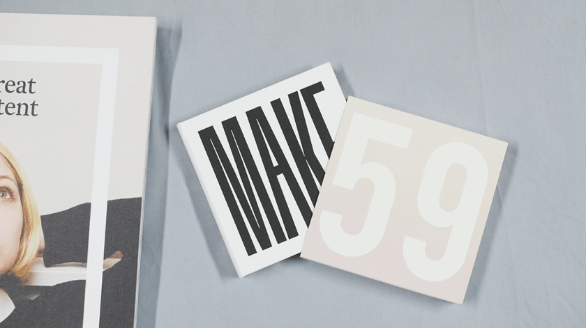
And I suppose I kicked into major KID MODE because all I could see in my brain after a couple of months was “GIMME GIMME GIMME.” Now, I think this is an achievement that I actually only got ONE palette, when I wanted all four of them—yes, even the one with 3 different tones of white. I had a primal attraction to this one, the Post-Impressionism Palette, and I’ve no idea why.
Just kidding, I have a clue. This one only has two lip shades, whereas the other two have four and Aether has 1 lip shade but 3 white eyeshadows. Process of elimination, I guess. But really, this one really called out 2 me. Ahem.
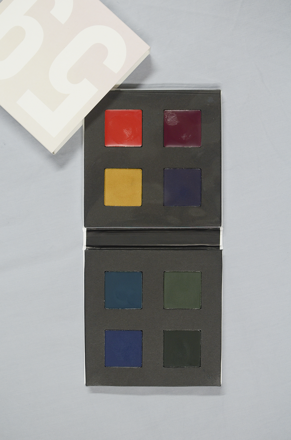
So, this one has two lip shades there, up top: Scarlet Oak a warm, orange-toned red, and Velvet Noise, which is a deep purple. The rest of the squares are eyeshadows. The yellow (Acid) and purple (Thunder) shades are satin finish eyeshadows, whereas everything else on that other square is a matte. Storm is a deep blue-green, Hudson Green is a medium moss green, Midnight is a deep midnight blue, and Poison Oak is a blackened deep green. The Post-Impressionism Collection was created by New York-based makeup artist, Sam Addington, in collaboration with photographer/filmmaker Erik Madigan Heck. His abstract, vibrant landscapes of the Hudson River Valley inspired this kickass modern collection. So freaking beautiful, I can’t even. This is made from “the lush depth in nature’s chromatic seasonal palette of saturated warm red hues, intense blues, and vivacious greens offset by lustrous yellow and purple.”
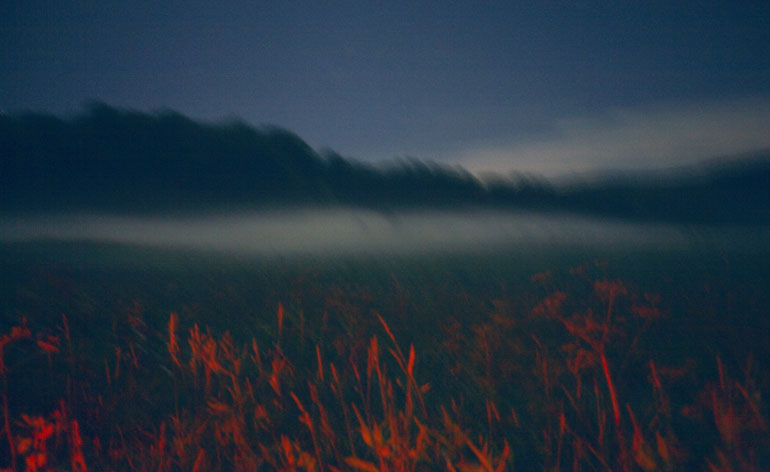
“For the collaboration, Heck, whose client list includes the New York City Ballet, the Metropolitan Opera, and Valentino Couture, headed up to the Hudson River Valley to photograph landscapes with Polaroid 59 film, and played with heating and cooling techniques that yielded highly saturated, Impressionistic colors.” (source)
See, this is the kind of thing that gets me. Like now, more than ever, I really want that Aether palette, even though I have a hunch that it’s not going to work out for me, at all. The ideas behind these things are what get me (and my money) so much. Anyway, these finger-swatch really really nicely.
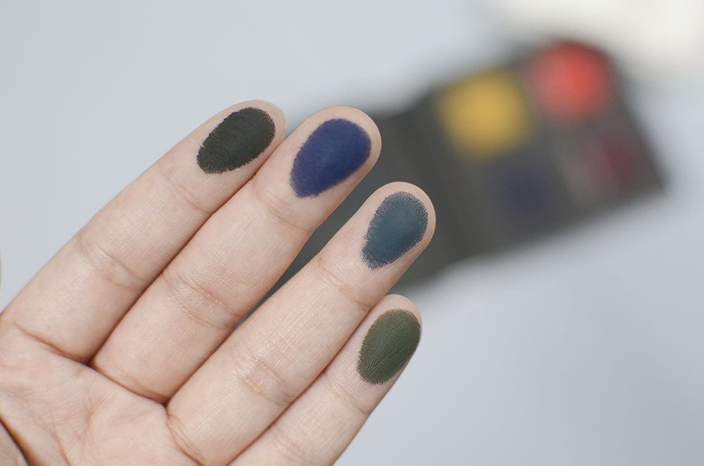
Swatched, L-R: Poison Oak, Midnight, Storm, Hudson Green
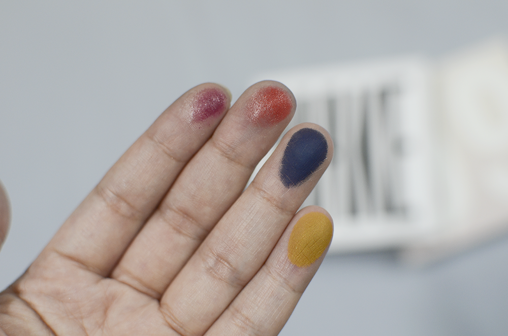
Swatched, L-R: Velvet Noise, Scarlet Oak, Thunder, Acid

But they look really bad, when swatched on the hand! I mean, ouch, right? This was done without primer, and I have never worn eyeshadow without eye primer ever since I discovered it—mostly to avoid drama and disappointment. On the eyes, this is great:
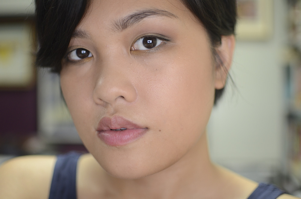
Used: Acid, Poison Oak, Midnight, Hudson Green
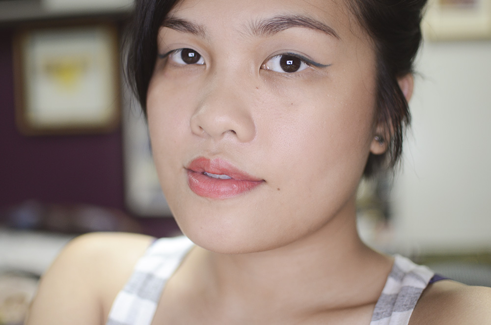
Used: Storm, Scarlet Oak

Used: Storm, Midnight, Poison Oak, Velvet Noise
I mean, love. I do love this thing. I think this would be great to bring along on short trips, one week max. I feel like it’s going to be battered at the end of a really extended vacation, and I’m mostly scared for the contamination of the lip products. It has a plastic lid that covers the lip product part and protects the lipsticks from the matte shadows, but the lid also encases the shadows in with the satin shadows. So, it’s not really much protection from those particular shades.
Anyway, I’m just so in love with this palette. Pardon my Filipino, but kinikilig talaga ako. I love shit like this. I love it when makeup companies have a really thoughtful collection or collaboration or packaging. I mean, I think this has been pretty obvious, but that’s my weakness, my Achilles Heel, my cause of bankruptcy. Honestly, wearing the colors in this palette makes me feel cool. And that’s what I’m after from palettes… not that it can make me feel cool, but that it elicits this strong a reaction from me. Objectively, it’s just makeup, but I love the fact that there is actual thought behind it… that it was made because something else that’s beautiful—in this case, landscapes of the Hudson River Valley, of all things—exists.
Ahem. I think it’s safe to say that I’ll be hounding all the Barney’s branches I “run into” on vacation. I don’t think you can expect anything less from me, sadly.
33.3% of all sales on WeSeeBeauty.com is donated to the We See Beauty Foundation, a non-profit organization dedicated to supporting the cooperative movement.
Follow me: Bloglovin’ • Twitter • Instagram • YouTube • Facebook

Hnnnnghh pretty palette!!! I knew that Storm would be really interesting as an eyeliner and yes you made it werq gurl. So beauty!
PS Kinilig~ ako for you! Hehe
Storm is awesome, I want to give it a hug! Thanks, bb! Kilig for everyone!
Ahhhhhhhhh, so beautiful! I love it when a palette has an artistic backstory like that. And it has nothing to do with being “naked” or “smokey.” 😉 Love the looks you created with it too.
Thank you so much, Liz! HAHAHA or nude~ I usually stick to the more neutral or safe looks, but I’ve been playing with colors a lot this month and it’s been so freaking fun!!
That blue-and-green look is so fierce!
Thank you, Pat!
Non-traditional, non-cliche colors in that palette, but they look so beautiful. It really does look like watercolors turned to makeup. ❤
Glad you think so too 😀
This is a beautifully curated palette, and I love the inspiration for it. I love how I made these work for you, and can I just say RAWR!! to your last look?? Fierce!
Err, I meant how you* made these work for you. Not me, obviously. 😛
HAHAHA I laughed so hard, Jen. But yes. Thank you so much 😀
Gorgeous palette! And damnnn that last look is amazing, I don’t think I’ve ever seen you with dark smokey eyes and you are killin’ it! 😀
LOL, I figured I might as well just go for it, and I’m glad I did 😀 This palette was made for boldness! Haha
Nafeel ko ang kilig mo Carina!! I love palettes (or any beauty product for that matter) that have stories behind them, too. Justifies price tag (if ever!) + the “but I already have something like that” excuse haha. Love the looks you’ve created. Dang gurl, dark smokey eyes suit you!! More smokey looks pls. GALING!!
HAHAHA hindi masyadong halata no?? 😀 Omg true… /eyes my Addiction palette pile… HAHAHA.
Thank you pls! ❤
Hey Carina, I doubt I have the skills to work with something like this, but you look amazing in all three looks! I am very partial to the third one. I think the shades really bring out your eyes!
Thank you so much, Sunny. 😀 I guess have to look for a place to wear it out, then!
Imagination’s the limit! I love the brightness of Acid and the depth of Poison Oak.
Agree 😀 Thank you for the comment, Kyaru!
I can read your excitement all the way from here! The third smoky look though.. get it gurl! I was pleasantly surprised at that look and I definitely think you should post more looks like those, so pretty!
P.S. Does WSB ship to the PH?
LOL kakahiya hahaha. Thank you, Justine! 🙂
I don’t think they do! I had to get a third party to buy this… LOL. Some of their products are available on Barneys, Birchbox, and Nasty Gal, though. 😀 I’m pretty sure at least Barneys and Nasty Gal ship here 🙂
Gah, I love when you do bold looks! Especially with the shades you have at your disposal, and ESPECIALLY that palette.
I’m going to be honest and say I’m not terribly impressed with the quality of Make’s eyeshadows based on the Celeste e Verde palette. They kick up a lot of fuss and are tricky to work with, and the way the palette is designed you have to be really careful about keeping the powders separate from the creams. I was also kind of meh about the quality of products in general. I was so excited to test out that matte/luminizer compact, but when I saw it up close it was so….grotty. And the performance wasn’t great. Even the Barney’s associate was meh about it, and she could have really sold it to me because I was in a very impressionable mood. (So, would this be my post-impression opinion? Nyark nyark).
THAT SAID. This is one case where everything else makes up for an underwhelming performance, and I totally agree with what you said about the feelings the palettes can bring up. I love how carefully each collection is designed, how adventurous the palettes are, and how strongly each collection evokes a specific mood/feeling. I’d never think to put the colors of the Celeste e Verde palette together, but it captures that technicolor California haziness so purely. (It helps that I was in LA at the time, where it really felt like I had the colors of the landscape tucked away in my purse).
Makeup collections nowadays are so predictable and boring, and the themes are so vague that brands can basically throw in whatever shades they want and invent reasons. But with MAKE the inspiration comes out so strongly in the palettes. You can tell that the artists’ preserved their various source material in the purest form possible, even if that means going rogue (Aether’s 50 shades of white). It’s the only brand that made me question: why these colors? Why this inspiration? What about this combination makes it work?
And maybe that’s what makes MAKE special: it invites you to look at makeup like you would a work of art. To study, appreciate, and ask questions. Or, if you’re shabby at art appreciation like yours truly, at the very least, it invites you to react and feel.
Thank you, thank you! Hehehe. 😀
Yes, I agree. I think the mattes kick up a bit more powder, because I notice bits of it ON the plastic lid from the mattes, but none (so far, yet) from the satins mingling in the lip pots. I bought that 2-way palette thing and am quite meh about it, ATM, but I’m sure there’s a way to use it that’ll make me swoon or something. Out of the 3, that’s the only one I’m a bit on the fence about. (Hahahaha I laughed, don’t werreh)
I knooow, I can’t explain it, but I still really love it. I love the promo shots for Celeste e Verde so much! I very nearly got that one instead, but I could’t let this one go haha. Like Liz said up there ^^ it’s refreshing to see a palette that doesn’t go the “smoky” and “naked” route, haha. See, that’s why I love these, too. They don’t give a fuck about “repeats.” Already got a matte dark blue? Let’s throw another one in. HOW ABOUT SOME 3 SHADES OF WHITE. What do you mean they’re all the same to you? ARE YOU AN ANIMAL. LOL. I love this so freaking much, I can’t even contain my glee. Obviously. I am like a toddler.
And here you are, being all philosophical about it, while I talk like a gorilla. CAN WE MEET UP BEFORE YOU LEAVE, BTW??
Haha I’m sorry, I agreed with your assessment so hard and just had so many feels that night and needed an outlet. Didn’t mean to make it sound like a rumination over some peyote brownies under the full moon.
Yes, I am planning something (daw)! I shall FB you for moar!
Yayz!
The third look is BEAUTIFUL! Something I don’t always see you wear but suits you well! 🙂
Thank you Juvy! 🙂
Anobayannnn kaganda! I feel like bold looks suit you more than neutral looks, or sobra lang ako na-wow sa last look. BUT STILL. Bravo!!!
Thanks gorl. ❤ Hahaha baka nabigla ka lang!
Pingback: MAKE Colour Aether Palette* | Softly Sometimes
Pingback: Quickie: Some Eye Bits from MAKE | Softly Sometimes
Pingback: Rounding Things Out: MAKE Colour New Medieval Palette | Softly Sometimes
Pingback: Review, Swatches & Dupes: MAKE Matte Finish Blush in Cinnabar | Through a Gloss, Darkly