

“White on White” is one of those works of art that I like whipping out to show people who just don’t get modern art. “Well, I could make that!” they decry, in a bubble of incredulity. The question is, did you?
Russian artist Kasimir/Kazimir Malevich founded a movement called Suprematism around 1913. It focused on the rejection of the depiction of objects, opting for “the supremacy of pure artistic feeling.” This work is one of the most famous from the movement, as is another one of Malevich’s work, “Black Square.” Suprematism has been briefly, though wonderfully discussed on this Tumblr post by WTF Art History.
Under the caption of “White on White,” WTF Art History writes, “A non-figural work, the White on White painting demands extended viewing in order to grasp the contrast between the white hues, the imprecise delineation of the inner square, and the effect such a painting has on you the viewer. Your response to the painting is what Malevich considered “the supremacy of pure feeling or perception in the pictorial arts.”
In the year 1913, trying desperately to free art from the dead weight of the real world, I took refuge in the form of the square. Kazimir Malevich
When I first saw the MAKE Colour Palette called Aether* (reviewed earlier this week), I immediately thought of Malevich’s “White on White.” The tonal shifts of white and the inclusion of neutrals that don’t have much contrast against each other—I thought that was a really brave palette to put out.
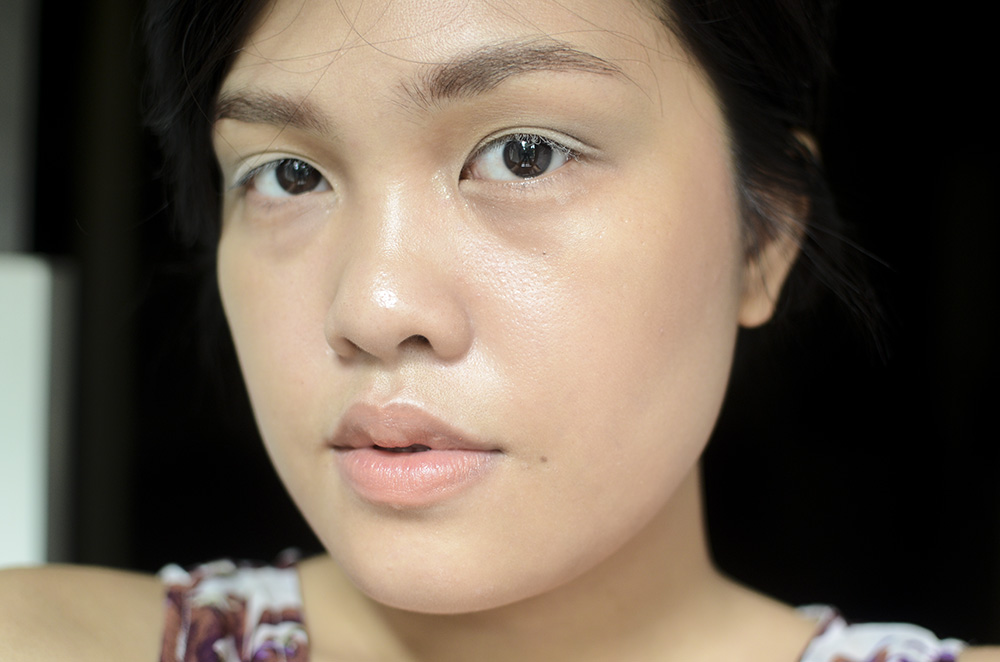
As with the painting I am trying to emulate with this look, this was kept bare but (in my mind) a little tonally complex. I used several shades from the Aether palette, namely “Warm White” on the inner and outer 1/3 of the lid, and “Salt Flat” on the center of the lid. On the crease, I blended out “Cool White” and “Cement” and then on the very inner corners, I put dustings of a pale shimmery shade called “Alabaster.”

I dusted a bit of “Warm White” on my lashes, just because! Hahaha I wanted it to look a bit stranger, I guess.
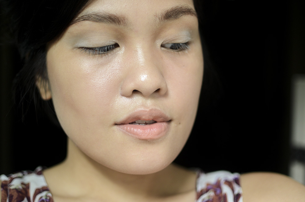
On the cheeks, I’ve got Kjaer Weis Cream Blusher in Abundance and on my lips, I have the ILIA Beauty Tinted Lip Conditioner in Dizzy, which is a light melon color that I used to mute down my lips. And that’s that! Haha I wanted the whites to be a bit more stark, but I think I’d need a stickier base for that. I really like how it turned out, so it’s fine.
Rest of the Makeup: Happy Skin ZZ Zit Zapper Second Skin Cream, Maybelline Fashion Brow 24H Coloring Mascara (Dark Brown)*, MAKE Transforming Eye Primer*
And something beautiful I found on MoMA’s website:
Malevich expressed his exhilaration in a manifesto published in conjunction with the first public exhibition of the series, in Moscow in 1919: “I have overcome the lining of the colored sky. . . . Swim in the white free abyss, infinity is before you.”
I hope you enjoyed this look I made for Made-Up History. For other works of art translated into looks, please click here.
* PR Sample
Follow me: Bloglovin’ • Twitter • Instagram • YouTube • Facebook

Great inspiration, and I love the look you came up with! It looks like something that could have come from the runway.
Thank you so much!! ❤
This is an interesting look. Did you wear this look outside in the “real world”? I wish one day I’ll be brave enough to sport edgy looks such as these. But my patients will probably freak out if I do. hehe.
I did, actually! Except I skipped out on the white lashes. 🙂
Again, I love this inspired and inspiring look! I think there was a white eyeshadow movement some months before, and it was love at first sight. And along a similar line of thought as ‘I could have drawn that’, my initial thoughts about bold white eyeshadow was ‘it’s so simple, why didn’t I think of that?’.
I think too often people forget to look at contemporary art in context. For me personally, the beauty of contemporary art is it’s thought provoking powers, and how much conclusions you have to arrive at for yourself.
Thank you so much! ❤ I think sometimes we overcomplicate things when distilling stuff to the basest and simplest forms is already beautiful. 🙂 I love that another layer of meaning exists in modern and contemporary art when you contextualize them!
This is the eye shadow Elsa should be wearing, not purple. Didn’t notice cement in your previous post. It really does look like cement powder made into eye shadow.
Aw, thank you! Haha I found her eye makeup so heavy nga hahaha. I don’t get it~ but I think it’s more friendly than all-white, Tilda looks!
ang. sarap. tingnan.
thank. you. hehe.
❤