All posts filed under: Playlist

Playlist: 4 Eye Looks Using bareMinerals’ A Vision in Velvet

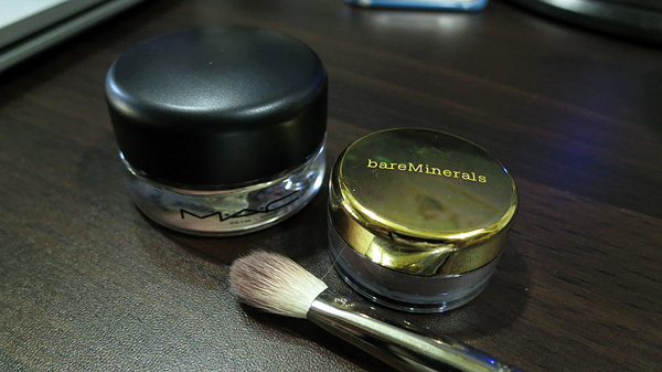
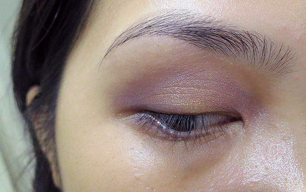
Here’s a closeup of my “new discovery” in this post. I’d gotten bareMinerals’ A Vision in Velvet without prior knowledge as to how to apply and work with mineral shadows. As a result, I was met with a disastrous first impression. However, with my faith in this product renewed by the awesomeness of a layer of MAC Paint Pot in Rubenesque all over my lid, I set out to try out some more combinations. After all, the thing comes in twenty shades. My eyes glazed over as I tried to come up with the permutations for those colors. As was mentioned, the first look (above) is just the Rubenesque Paint Pot all over the lid, with Satin Plum on the crease and the inner and outer corners. Pretty. It’s pretty subtle, too, with the shimmers visible only up close. Here, I just swiped Velvet Violet over the center of a lid, for an overall purple-y look. It’s a little less warm and a little more intense (for some reason?). Next, I started with a clean …

Playlist: MAC Paint Pot (Rubenesque) & bareMinerals Satin Plum

I lifted my makeup ban and got a MAC paint pot yesterday, which I had been meaning to for a while. Paint Pots are essentially cream eyeshadows that you can wear alone or as a base for your eyeshadows. I don’t know if they have other functions, but I think that alone is pretty cool in itself. I got it in Rubenesque, which is a beautiful peach bronze that has hints of rose at some turns. Anyway, I’ll review this some other time, but all you really need to know is that I really freaking love it so much. In the middle of uploading work stuff, I decided to play with my new paint pot and one of the shades that came with bareMinerals’ A Vision in Velvet, which let’s face it, really swatched pretty horribly. Not one to give up on underperforming things—and also things that cost me $80—I was eager to try and make a few looks with some of the shades. This is the first look I’ve tried in literally three minutes, …

Playlist: Playing with Prestigious Bordeaux

So, I woke up this morning and thought about playing with my new Prestigious Bordeaux eye and cheek palette from Shu Uemura’s Karl Lagerfeld collection, which I reviewed here. (image from here) Bordeaux is a mix of red and violet, with a hint of brown (see here). A color close to it is Pantone’s 221 (which they call Rose Pink for some reason). The Prestigious Palette shades seems to be a deconstruction of the color, separating the tones into their own pans. Since there are two distinct group of colors—purple and brown—in the palette, I wanted to try out looks that don’t result into a muddy mess. I looked at Patricia Lee’s tutorials, since she posted about two looks that used the purples and the browns. Anyway, I tried. (Also, please remember that I did this after waking up. The only products on my face are Etude House Proof 10 Eye Primer, a bit of concealer, Smith’s Rosebud Salve on the lips, and the palette colors itself. My hair is funny.) My (actual) right eye, …