

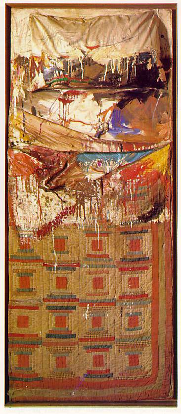
“Bed,” Robert Rauschenberg. 1955
Source: Brown Bread Mixtape
“Bed” is a combine which is what Rauschenberg called pieces he made where he brought together the concepts of a found object and a painting (or a flat, wall-bound work). Rauschenberg worked as a costume and stage designer between 1955-1964, which may have had an influence over his work and use of materials.
In this particular combine, he used an actual bed or beddings—rumored to be his own—and made it his canvas. This sets it apart from the traditional understanding of a painting or a sculpture. He also makes use of the “paint drip,” which at the time was sort of symbolic of Abstract Expressionism, a movement based on the artist’s subjective experience and arguably popularized and embodied in the world’s cultural consciousness by Jackson Pollock’s Action Paintings.
In this video, the two “hosts,” Dr. Beth Harris & Dr. Steven Zucker, discuss the probable meaning of this work, especially in the context of when it was made in 1955, at the cusp of Pop Art and Post-Modernism, moving away from the earnestness of Abstract Expressionism.
“Bed” stood out to me, I think, because it made perfect sense when I saw it. It’s both colorful and grimy, and though it is said to be a sort of cheeky little response to Abstract Expressionism’s sincerity, I think it also has a bit of earnestness in it too. Maybe that’s just evident to me. I’m not an expert—just someone who enjoys art—and maybe this is a little joke, but I took it very seriously.
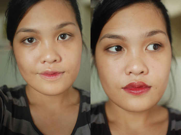
But anyway. Here are my first two attempts! On the left, I used a lip concealer (in a failed attempt to recreate the griminess of the painting) and on the right, I decided to fill the lip all the way with the lip color I chose.
But it didn’t really feel anything like “Bed.” I do like my eyes, though.

So I erased my face and remembered one of Rauschenberg’s most famous works of art, “Erased de Kooning Drawing,” which he made in 1953, exploring the possibility of creating a work of art through pure erasure. He asked Willem de Kooning for a drawing, for the sole purpose of erasing it. After getting over his initial shock at the request, de Kooning picked out one of his best works, made with crayon, pencil, ink, oil paint, and charcoal because he did not want to make it easy for Rauschenberg. He said, “I want it to be something I’ll miss.”
It took Rauschenberg about two months to delete as much as he could from the work. Jasper Johns created the inscription. Through scanning remaining traces of the work, SFMoMA tried to replicate how the drawing could have looked like (there are no existing photographs of the work) here. Rauschenberg talks a bit more about that here:
So, for me, attempt no. 2, with worse lighting:
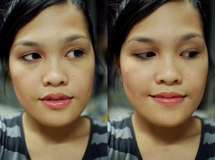
I think this is closer to “Bed,” though still quite not there yet. I’ve spent quite a while trying to figure it out, but it has stumped me quite a bit. The thing is, it’s really colorful but also quite dirty and grimey, and neutral as well. It’s hard to distill both aspects of that, I think.
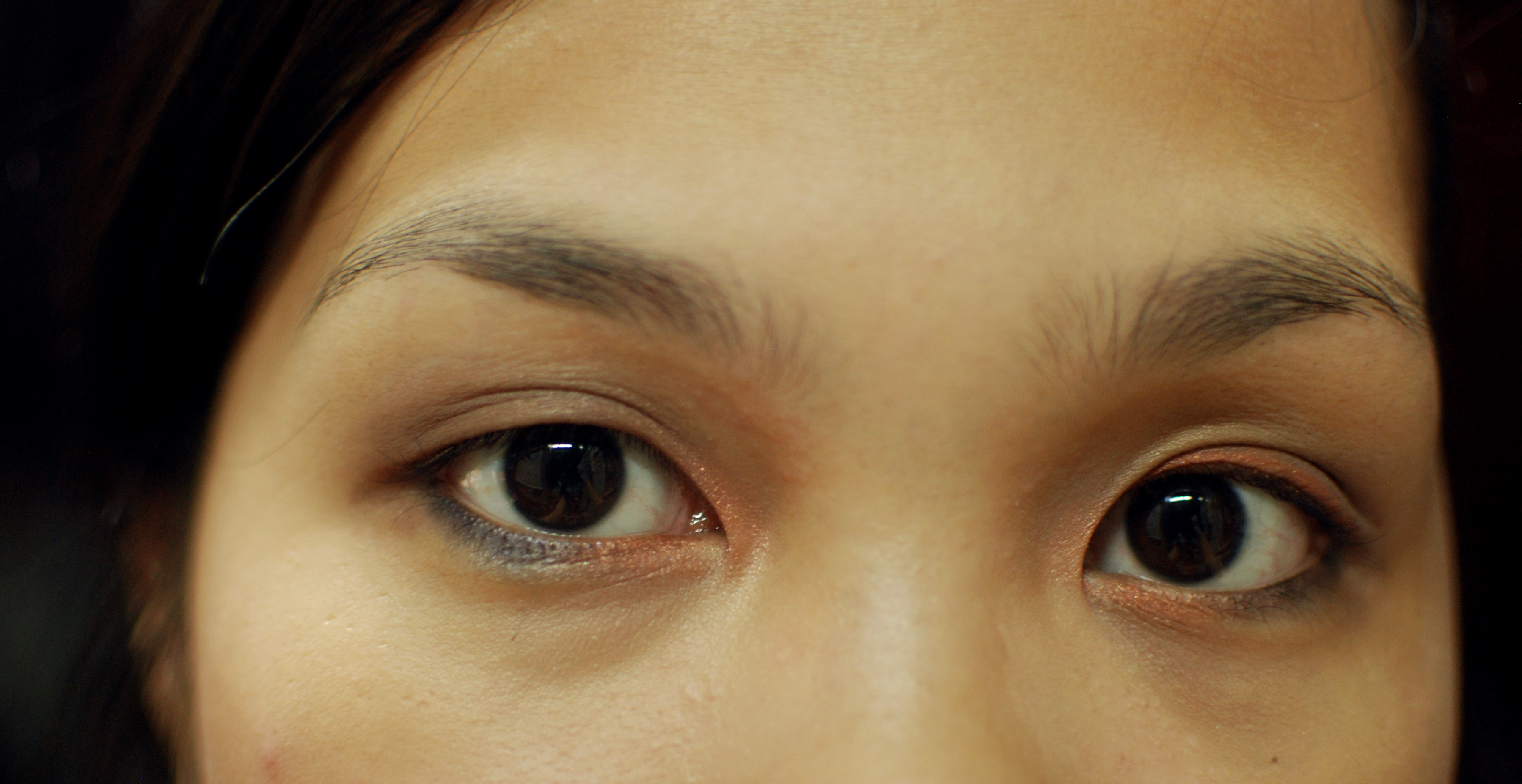
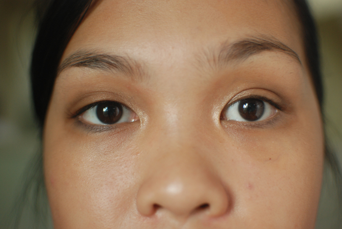
I think I could have used a warmer eye, but I just patted on a cool taupe all over the lid up to the crease, and lined the upper lash line and inner third of my lower lash line with a warm rust. I lined the outer two-thirds of the lower lash line with a beautiful sparkly deep navy. On the inner corners, I used a pretty shimmery peachy pink for some brightness.
Products used for the failed attempt:
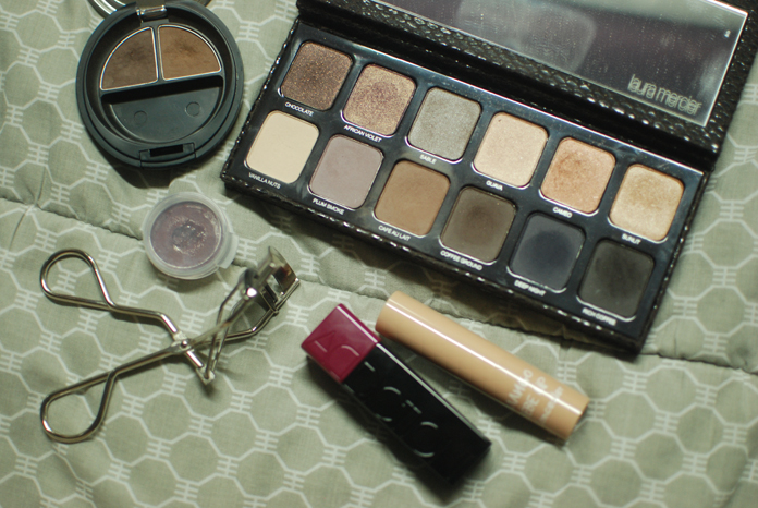
The Body Shop Brow & Liner Kit in 02, Laura Mercier Artist’s Palette for Eyes, Nature Republic Mango Bebe Lip Concealer, Addiction Cheek Stick in Suspicious, shu uemura Eyelash Curler, Shiro Intertube in Team Buffy.
Products used after the erasure:
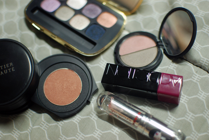
bareMinerals Ready 8.0 in The Cocktail Hour (used Spiked and Shaken Not Stirred), Le Métier de Beauté Brown as a Berry duo (now available on the LMdB website as “Parfait Perfect“), Addiction Cheek Stick in Suspicious, shu uemura x Karl Lagerfeld Rouge Ultimate in Celebrity Beige, Le Métier de Beauté Kaleidoscope Eye Kit in Northern Lights (used Magnetic).
Hope you enjoyed this! He is definitely one of the most interesting people, I feel like.
Photo by Dennis Hopper
If you want to see more Made-Up History, click here.

Pingback: New York in September via the MoMA | Nothing Spaces