Month: August 2013

Smashbox Image Factory Air Blush Whipped Cheek Color in Dusty Rose

This blush by Smashbox is one of the things I bought on a whim but I rarely ever use. Digging it up to review it, I’m reminded of why I impulsively bought it in the first place. For one thing, it is pretty gorgeous. Dusty Rose gives such a natural flush to the cheeks, with such a pretty color coupled with a beautiful texture. If you couldn’t already tell from the name or the picture, this has a pretty mousse-y consistency—a lighter texture than cream blushes. It is blendable and light, though fairly pigmented and is layer-able without much issue. I usually use a stippling brush when I apply it, though it goes on fairly well when used with fingers. Dusty Rose is a warm, rosy color that adds enough warmth and pinkness to the skin. It really looks like you have no blush on. Because it is whipped/a mousse, it dries down to a sort of velvety finish. On the face, it is noticeably natural, too. Does that make sense? I’ll call it that …

Nosy Beauty Vol. 8: Johna

For this week’s Nosy Beauty, I asked Johna, a copywriter for an ad agency, to share her makeup bag. She spends her non-work days writing, reading, and exploring the city. “I write mainly personal essays, but have recently been trying poetry, including spoken word,” she says. BAG “My makeup bag works more like a trusty toolbox than a kikay kit. In it are contact lens eyedrops, hand sanitizer, cologne in a Travalo atomiser, mint, floss, scrunchie…and only a handful of makeup for retouching.” “This is as kikay as it gets inside. I have a Majolica Majorca Pressed Pore Cover, which is excellent as a finishing powder or to cover up shine. The lip products I never leave home without are a NARS Lipstick in Dolce Vita, Canmake Stay-on Balm Rouge in 04 and Clarins Colour Quench Lip Balm in 08—all of which are barely-there shades. I use Clarins for when I feel for a little gloss and shine, and Canmake to simply ‘accentuate’ my lips’ actual pigment, if that makes sense. When I want a …

Drugstore Finds: Bourjois Healthy Mix Serum & Correcting Concealer

The Bourjois Healthy Mix Serum Foundation and the Bourjois Healthy Mix Correcting Concealer are two of my favorite face products at the moment. I was starting to swear off liquid foundations as the weather was just getting too hot and humid, but I couldn’t resist the Bourjois counter in Vietnam. It’s a little bit more pricey than retail in the UK, but it’s worth the little extra, because these are just so good! I got both in shade 53, which is 53 Light Beige for the foundation and 53 Dark Radiance for the concealer. I don’t like going lighter on foundations, so I didn’t want to risk it and got one of the darker shades available there. The consistency of the serum foundation is very smooth, though it’s not runny. It’s a gel, to be more specific. The concealer takes a bit of work. I like to warm it up between my fingers. I use it both on my under eye darkness and some blemishes, and it works great for both. It doesn’t really last …

Inspired by Literature x 20th Century Book Tag

Taking a page out of Jessica of Getting Cheeky’s book (get it?), I decided to try and translate literature into makeup colors. I won’t be doing anything like Made-Up History, which is a series I made up where I take a work of art and translate it to a makeup look, just a selection of colors I think that make up pieces of literature. Click here for her Inspired by Literature series. For this first post (of many? Possibly), I picked books that I spoke about on my 20th Century Book Tag Video, which you can watch here: Without further ado, here are the photos! 1900s — What Maisie Knew by Henry James NARS Eyeshadow Trio in Delphes, NARS Pure Matte Lipstick in Montego Bay I chose quite soft colors for this particular book cover. I haven’t actually read this yet, but I know that it has a lot to do with innocence. 1910s — Dubliners by James Joyce NARS Eyeshadow Duo in Paramaribo, Guerlain Rouge G L’Extrait in Orgueil Quite a depressing, though realistic …

Drugstore Finds: Wet n Wild Eyeshadows in Nutty and Penny

Here are two of my favorite drugstore finds, the Wet n Wild Single Eyeshadows in Nutty and Penny. Notorious for being MAC dupes for Satin Taupe and Expensive Pink respectively, both shadows perform very well on their own, too. Nutty is a somewhat frosty taupe, a beautiful in-between brown and grey shade. It is quite cool in my eyes, though I have trouble estimating color temperature. Penny is quite a pretty golden-pink shadow. It has a coral pink base and shifts golden, depending on the light. The complexity of both shadows are more evident in a 3D setting; in other words, on the eye than as a swatch. I used Nutty all over the eye in the following look: I think it’s quite a pretty neutral that adds the right amount of depth and textural dimension to the eye. I don’t think it’s an exact dupe of MAC’s Satin Taupe, but it’s close enough: On the left pair of swatches, Satin Taupe sits on the left of Nutty. Penny is a bit more exciting, I …

shu uemura Glow On Blush in Soft Mauve 225

Here’s a tricky little bugger. I bought the shu uemura Glow On Blush in Soft Mauve 225 after seeing it on a beautiful blogger, who sang it praises and I WANTED THAT GLOW. I wanted it! Unfortunately, I forgot to take into account the difference in our skintones, hers being quite pale. I am not pale. So. There. I had such a big problem with this blush, because it was so light and didn’t want to show up, no matter what I did. Enter, the Illamasqua Blush-Up Brush: It’s a dense, stiff brush that is just perfect for people like me who insist on wearing too-light colors. Ta-da! Aaaand here is a very heavy swatch: Soft Mauve 225 is a really pale lavender and it looked to be like the impossible dream. I don’t get a “true-to-pan” color on my cheeks, obviously, but I like the effect it lends. I’ve yet to try it under a cream, neutral base, but I’ve worn this mixed with other blushes, to great results. The blush itself is a …

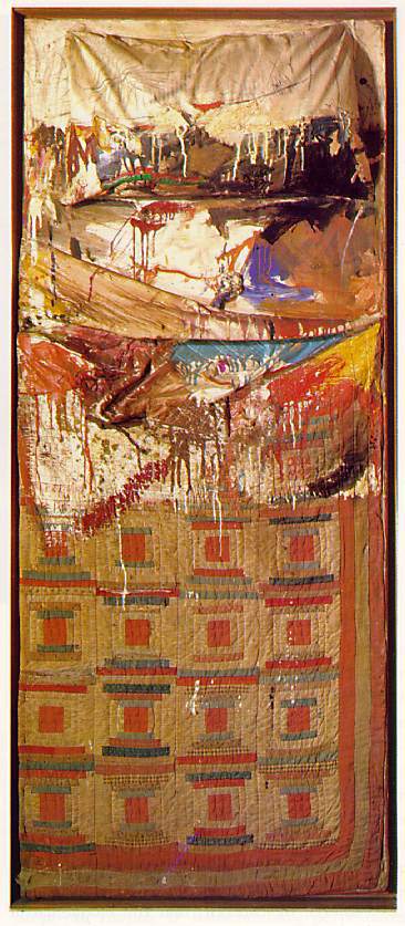
Made-Up History: Robert Rauschenberg’s “Bed,” 1955

One of my favorite artists is Robert Rauschenberg. The first Rauschenberg that I consciously “saw” was “Bed,” which was on display at the Museum of Modern Art (MoMA) in New York City. It appealed to me in a very visceral and decidedly aesthetic way. I couldn’t explain why I liked it; I just did. “Bed” is a combine which is what Rauschenberg called pieces he made where he brought together the concepts of a found object and a painting (or a flat, wall-bound work). Rauschenberg worked as a costume and stage designer between 1955-1964, which may have had an influence over his work and use of materials. In this particular combine, he used an actual bed or beddings—rumored to be his own—and made it his canvas. This sets it apart from the traditional understanding of a painting or a sculpture. He also makes use of the “paint drip,” which at the time was sort of symbolic of Abstract Expressionism, a movement based on the artist’s subjective experience and arguably popularized and embodied in the world’s …