All posts tagged: make colour

FOTD: Celeste e Verde

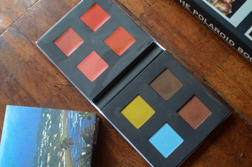
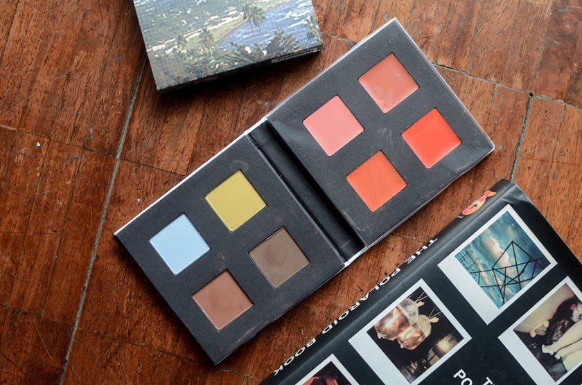
Hello everyone! I just wanted to share a Face of the Day feat. the first look I ever attempted with MAKE Colour's Celeste e Verde Palette* (reviewed) because it's such a fun look that totally goes against the fall leanings of the makeup people have been wearing this season. Although I sometimes base my makeup on the Western hemisphere's concept of seasons, I'm not going to let the onset of autumn stop me from wearing pastel blue and yellow eyeshadow! I used Palermo, a pretty canary yellow all over the lid, fading out into the warmer brown, Brick in the outer corner, with Earth (a neutral brown) buffed out into the crease. I used my finger and the NARS Eye Brush no. 3 for the yellow lid shade, and a MAC 217 for the crease and outer corner shades.

MAKE Colour Celeste e Verde Palette*

I first saw the MAKE Colour Celeste e Verde Palette* on Bea‘s Instagram, which rekindled my interest in the brand. Celeste e Verde was created by Maryam Nassir Zadeh and Ozzy Salvatierra for MAKE. The Celeste e Verde (Sky Blue and Green) makeup collection is inspired by Antonioni’s 1964 film “Red Desert.” It reflects a woman and her style in life: a life that feels spiritual, artful and authentic. The palette is a colourful mix of contemporary pastels, fiery brights and seaside blues. Colors are nostalgic, fresh and natural. I looked at some stills of Red Desert and this entire collection is a spitting image of that color story.

Made-Up History: Kazimir Malevich’s “White on White,” 1918

“White on White” is one of those works of art that I like whipping out to show people who just don’t get modern art. “Well, I could make that!” they decry, in a bubble of incredulity. The question is, did you? Russian artist Kasimir/Kazimir Malevich founded a movement called Suprematism around 1913. It focused on the rejection of the depiction of objects, opting for “the supremacy of pure artistic feeling.” This work is one of the most famous from the movement, as is another one of Malevich’s work, “Black Square.” Suprematism has been briefly, though wonderfully discussed on this Tumblr post by WTF Art History. Under the caption of “White on White,” WTF Art History writes, “A non-figural work, the White on White painting demands extended viewing in order to grasp the contrast between the white hues, the imprecise delineation of the inner square, and the effect such a painting has on you the viewer. Your response to the painting is what Malevich considered “the supremacy of pure feeling or perception in the pictorial arts.”

MAKE Colour Aether Palette*

I was kindly sent the MAKE Colour Aether Palette* by the folks over at MAKE and Autumn PR, which was exciting for me, as I wanted this so badly but settled on trying out one palette first, the Post-Impressionism Palette (reviewed here), which I ended up loving a lot. The reason for this edit-out-in-favor of another palette is because… well, this palette is a bit experimental as far as palettes go. Aether is an artist collaboration with Faye Toogood, a furniture designer, and makeup artist Ayami Nishhimura.

5 Things Friday: Magical Products

Since it’s Harry Potter Week here, I decided to pattern my 5 Things Friday on 5 “Magical” Products that I’ve encountered in my brief makeup life. I have skin care and seemingly boring-ish products here, but they’re the things that actually let makeup be exciting because they take care of the basics. Aesop Parsley Seed Cleansing Masque I rotate a lot of skin care products, but this one is a mainstay. This is a great wash-off clay-like mask that just jumpstarts your skin when it’s starting to seem a little weary and dull. I don’t always remember to use this (lazy), but when I do, I always wonder why I keep forgetting about it. Hourglass Veil Mineral Primer I bought this expensive bottle on a whim—serious liquid gold, folks. This just preps and primes my face for whatever else I put on it. I find that it just makes everything look better. This is what I suspect turned me into a primer nut, but even though I’ve met a lot of good ones after this …

5 Product Face No. 4

MAC Paint Pot in Painterly // MAKE Colour Post-Impressionism Palette, used Storm and Scarlet Oak // K-Palette 1 Day Tattoo Lasting 2 Way Eyebrow in 102* // Kjaer Weis Cream Blush in Abundance // bareMinerals Mineral Veil Yay, another 5 Product Face. I really love making these things. I mean, if I didn’t already say… which I did. HEH. Anyway, this is a pretty simple look that relies on colors for the drama. 🙂 I used Storm, which is a matte deep blue green, as a liner and I really exaggerated that wing. (As you can see.) For lips, I used Scarlet Oak, which is a warm red orange. These two came from the MAKE Colour Post-Impressionism Palette, so they’re technically from only one product. Do I count this palette as two products? I probably should—I wish I did without the paint pot (used just to neutralize the lids), if that’s the case. Let’s pretend I didn’t use it… please? Brows are by the K-Palette marker/powder duo* in the medium, warmer brown, 102, and cheeks are …

MAKE Colour Post-Impressionism Palette

Hello, everyone, from this beautiful piece of beauty. (I mean the palette, obvs.) Where do I even begin? I mentioned it before, but I’ve been hankering for these palettes since the dawn of time (at least, in my beauty blog history anyway…) and I didn’t cave until now. I first saw Wiji with the Medieval Palette, which was on my original radar~ and then a long time after that, I saw Bea with the Celeste e Verde Palette. And I suppose I kicked into major KID MODE because all I could see in my brain after a couple of months was “GIMME GIMME GIMME.” Now, I think this is an achievement that I actually only got ONE palette, when I wanted all four of them—yes, even the one with 3 different tones of white. I had a primal attraction to this one, the Post-Impressionism Palette, and I’ve no idea why. Just kidding, I have a clue. This one only has two lip shades, whereas the other two have four and Aether has 1 lip shade …